Simplifing The
Booking &Traveling Experience
STARLUX AIRLINES | Traveler Application
STARLUX Airlines
STARLUX Airlines was founded during the pandemic in 2019. I utilized a rapid innovation program and emphasized design validation to introduce a wide range of state-of-the-art services to improve their Passenger Traveler Application. The majority of the functionality was an industry first in Taiwan, which placed STARLUX Airlines at the forefront of the aviation industry. It has been one of the fast-growing airlines during the pandemic.
The products were released in the app store and on the official website in November 2021.
Some of my future-facing work is under NDA, below features have been released to the public. Products and images are owned by STARLUX Airlines.
MY ROLE
UX Design Lead
Experience Designer
MY TASK
User Interview
Data Analysis
Competitor Analysis
Contexual Inquiry
Forums Review
Wireframing
Copywriting
Interaction Design
Prototyping
Usability Testing
TEAM
Project Manager
Visual Designer
iOS Developer
Android Developer
CLIENT
STARLUX Airlines
PROJECT RELEASED
NOV 2021
BACKGROUND
A new airlines that's expanding
STARLUX Airlines was founded during the pandemic in 2019, with only three routes operating from Taiwan within Asia. Since then, the airline has been expanding to cater more directly to their repeat customers.
However, the digital product wasn't fulfilling the original plan of the business goals and traveler's needs:
NEW AIRCRAFTS
STARLUX started to have multiple types of aircraft A321 neo & A350, which provide different experiences for each individual.
LONG HAUL FLIGHTS
An increase in cross-region destinations and long-haul flights require airlines to provide more assistance to the passenger at the airport.
FREQUENT FLYERS
An expanding customer base who are higher tier status and expect a more customized service.
Challenge
Being the only airline founded globally during the pandemic, the media has been observing what's the next step!
As a UX design lead and experience designer who is revisioning the future of STARLUX, my mission was to :
- Converting the business goal of increasing sales.
- Honoring the experiences of increasingly diverse types of travelers into our design goal.
MY CONTRIBUTIONS
What did I do?
I worked with STARLUX Airlines on various design initiatives for Passenger Traveler Application and collaborate with the Traveler Booking Website team to make the commerce experience more fluid. I accomplished this by aligning with their travel journey from ticket purchasing, check-in to arrival, and interruption (flight delays & cancelations).
A lot of my time went into R&D rounds of searching for creative applications of transportation, articulating user stories, crafting personas, and building/ testing prototypes during contextual inquiry on-site.
COMPETITIVE BENCHMARKING
Discover the Hospitality Industry Landscape
To find out how users would feel about browsing destinations directly on an airline app rather than on general booking sites, I started by conducting benchmarking to identify what the competitors are doing right and what can be improved while keeping these questions in my mind:
- What is the process the user has to go through to book a flight? How long does it take? Do the affordances truly help or hinder the process?
- Is the booking process intuitive?
- How does the app forgive the user's mistakes?
- What are the pain points the user experiences and how can I make it hurt less?
- What do the other features of the app aside from booking are frequently used?
I categorized the data into Homepage, Search & Select, Entering Details, Payment, and Trip Management.
The majority of the research studies are under NDA, please contact me if you want to know more.
CONTEXTUAL INQUIRY
What Do Travelers Need in Their Journey?
If one step goes wrong, you might miss the flight.
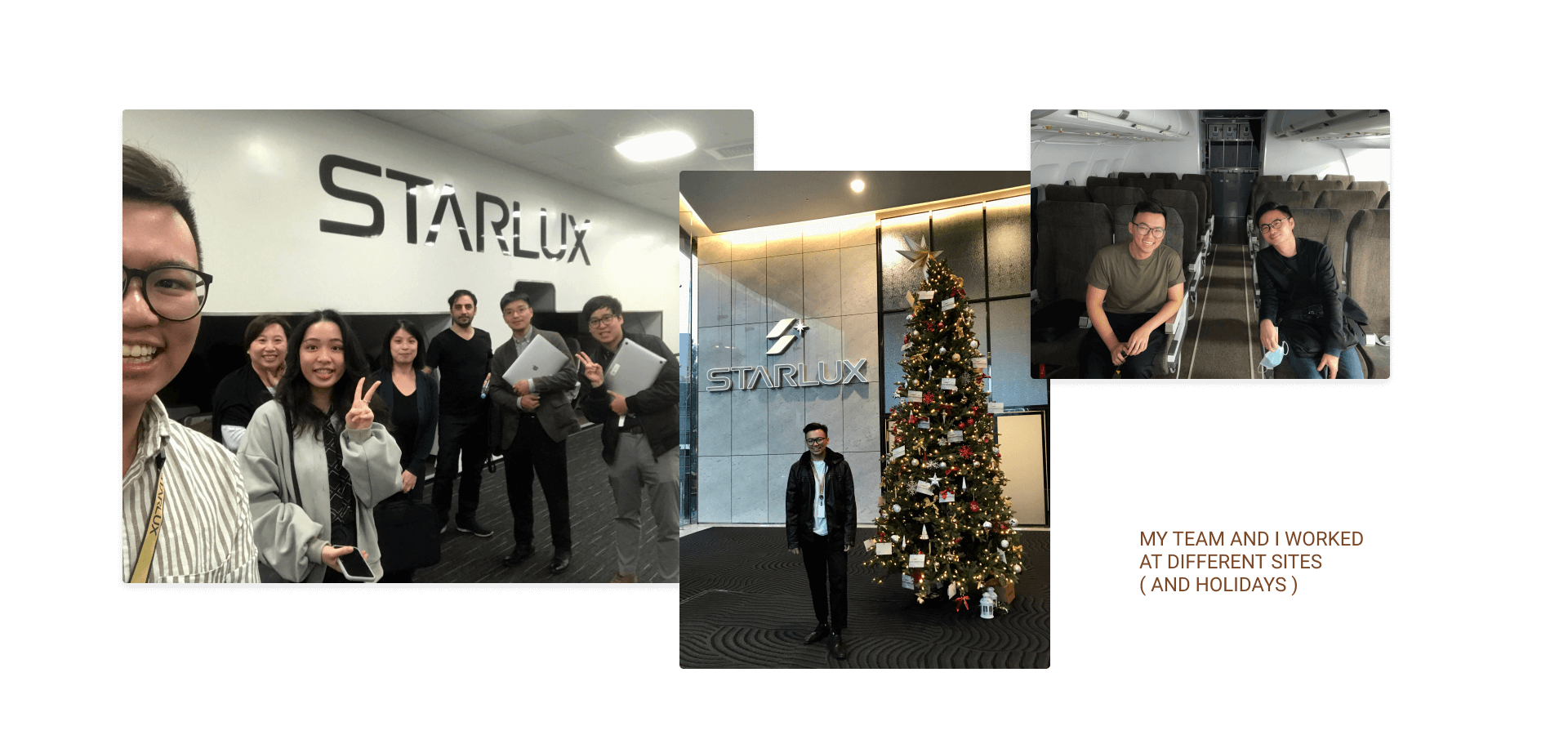
With all the new growth STARLUX Airlines is poised to make Taiwan the next central transportation hub between Southeast Asia to Europe and North America. What do travelers need when they are going to spend more time in the airport? I went on-site to observe how passengers navigate in the airport and talked to different branches of airline staff about what they encountered in their daily work and the busy holidays.
My research reveals that most flyers agree that the process of going through the airport is overwhelming and not pleasing. Flyers and staff mentioned that talking to the airlines' staff can increase the emotional tension, especially when they are in foreign countries.
However, the disadvantageous experience could be solved by providing information ahead on app to the passengers for personalized navigation via their mobile devices.

Design Goal
Transforming Your Purchase and Travel with Human-Centered Innovations
Boosting the ticket sale while empathizing with passengers' flight journey from check-in to arrival and transfer, we used our research finding to form a new design that aims to disrupt the status quo of travel by creating an experience that everyone is looking forward to.
BUSINESS DRIVEN
Provide destination inspiration for potential flyers. Strengthen the flow of the booking system and minimize the input steps.
DYNAMIC INFORMATION
Passenger-centered design: suggest relevant info so traveler knows what to expect at each step in the journey.
MEMBER PRIVILEGE
Emphasize COSMILE Member's privileges and benefits with manifold ways of milage usage to encourage more flying.
Wireframes & Flow Diagram
With the key features and user flow defined, I started to capture my ideas by making Low/ Mid-fidelity screens. It enabled me to examine my ideas with other departments and demonstrate ideas in a digital system.

Image has been blurred out due to NDA
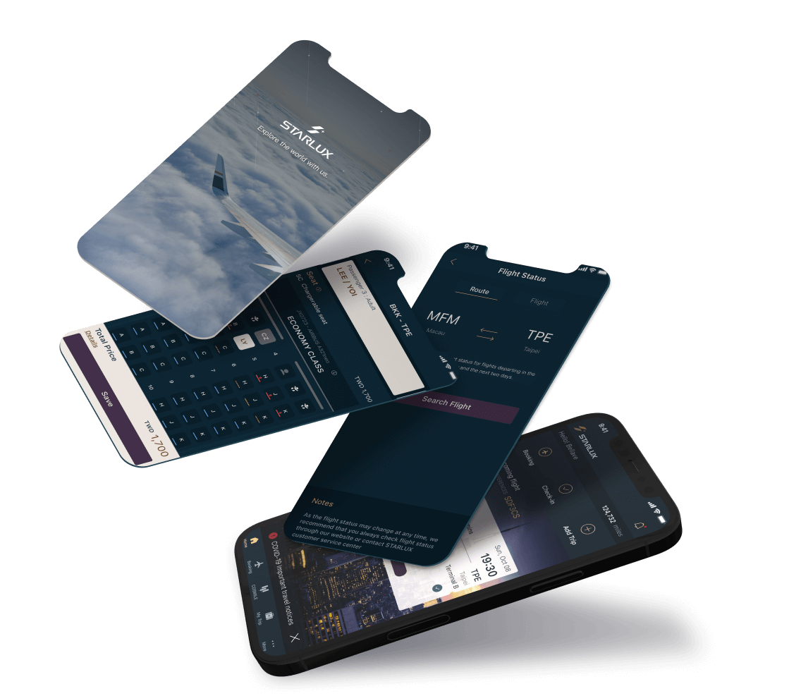
INTRODUCING - STARLUX APP
YOUR NEW TRAVEL MOOD BOARD
& FLIGHT ASSISTANCE
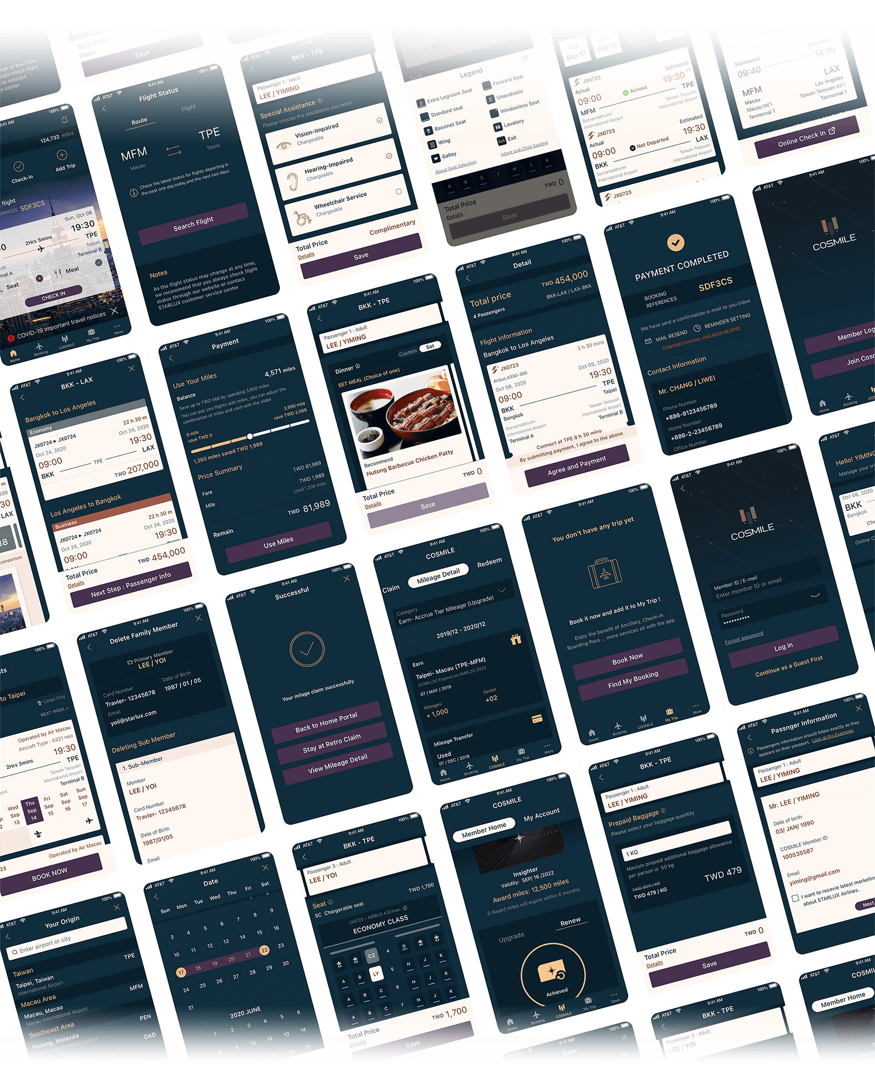
An app that inspires travelers to book various destinations using STARLUX’s elevated service.
It works to assist individual flyers with customized information that only shows up when it’s needed.

1. HOMEPAGE
Ingenious arrangement to keep reminders intimate
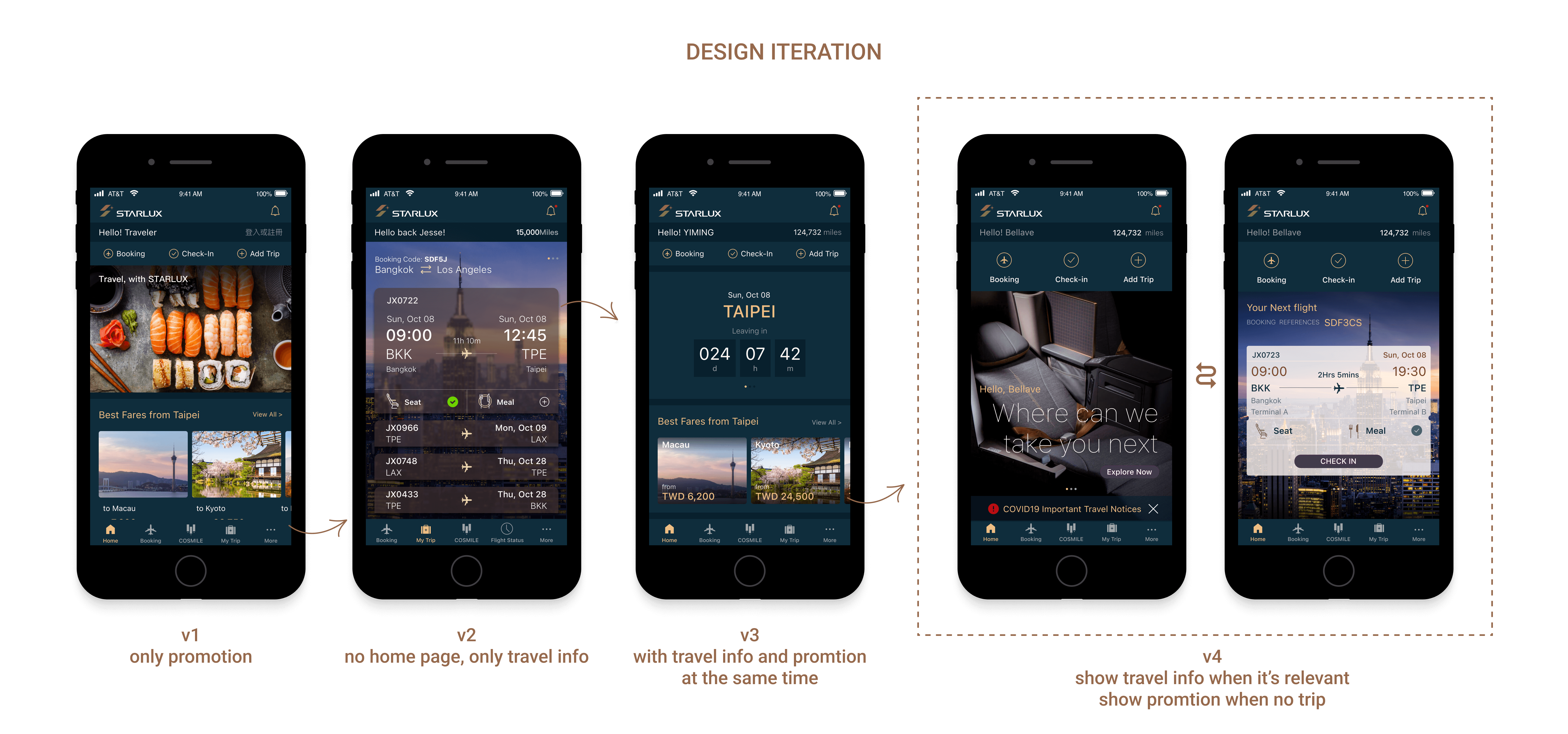
After our first sprint, we realized we would need a new unifying ‘home’ experience to align passengers' experience with digital information. Especially with the upcoming new route, we tried a few solutions before settling on ‘The Time Card.’ I tested the time card against the existing experience head-to-head, and it was well-received with spontaneous praise. Passengers maintain a birds-eye view of all of their essential travel information, and the information only shows up when the passengers needed it during their trips so that the user will feel cared for rather than annoyed.
2. TICKET PURCHASING & BOOKING
How to facilitate the user's purchase decision-making process and give clear guidance?
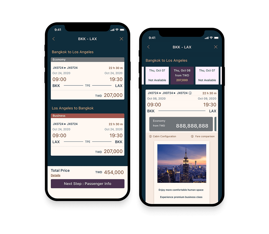
Designed a new booking process where passengers can purchase the tickets in 7 mins
In the process of booking air tickets, whether it is flight information, service content, prices, precautions, etc., users need to understand and confirm repeatedly. To avoid these burdens becoming obstacles, we organized the information into a concise and easy-to-understand structure, and the operation steps are divided into easy-to-focus processes and moving lines.

To find out if the design is effective, I proposed and conducted A/B testing where participants were asked to complete the same trip booking on different design elements and information presentation.
3. MY TRIP/ ANCILLARY SERVICE
How do passengers plan their flights ahead?
Knowing the airline is having more long-haul flights and transit passengers, we brainstormed with the meal catering team to redesign the meal selection feature that allows every passenger, even economy class, to choose the meal ahead to reduce food waste on board. Every passenger knows what to expect since they've pre-selected their entrées to feel secure their food needs are going to be met. The new app also allows purchasing different services ahead that customers could receive an exclusive price to keep in mind the main demographic of STARLUX Airlines and further improve their highly regarded In-flight Service. I'm very proud to find a design pattern that worked for all our ancillary products with minimum variation.

4. COSMILE MEMBERS
Catering the frequent flyers
After a few years of operations, the airline has more travelers and many have become a higher tier status. With that in mind, I talked to frequent flyers to understand what they wanted to access on the app. We focused on a few directions listed below.
• Future Status - Knowing how many flights they need to upgrade or renew along with benefits.
• Millage Usage - Using the miles to redeem award tickets or purchase partially directly on the app.
• DutyFree - Preorder member-only duty-free.
• Family Profile - Allowing more ways to collect millage with other family features.

5. FLIGHT STATUS
For those who are waiting
Not only passengers, friends, family, and even cab drivers would also benefit to use the app to check the flight status. I looked at all the information and reorganized 12 types of flight status so that users understand the current status of the flight for them to plan their day accordingly.

6. DATA PRIVACY & SAFETY
Your safety is important, even your data
After numerous discussions with the IT team, we incorporated several security measurements, such as two-factor authentication when members are processing security-sensitive activities. With the thoughtful consideration of data privacy and security, We received double certifications in Information Management.
Outcome
Significant impact to focus on traveler's real needs
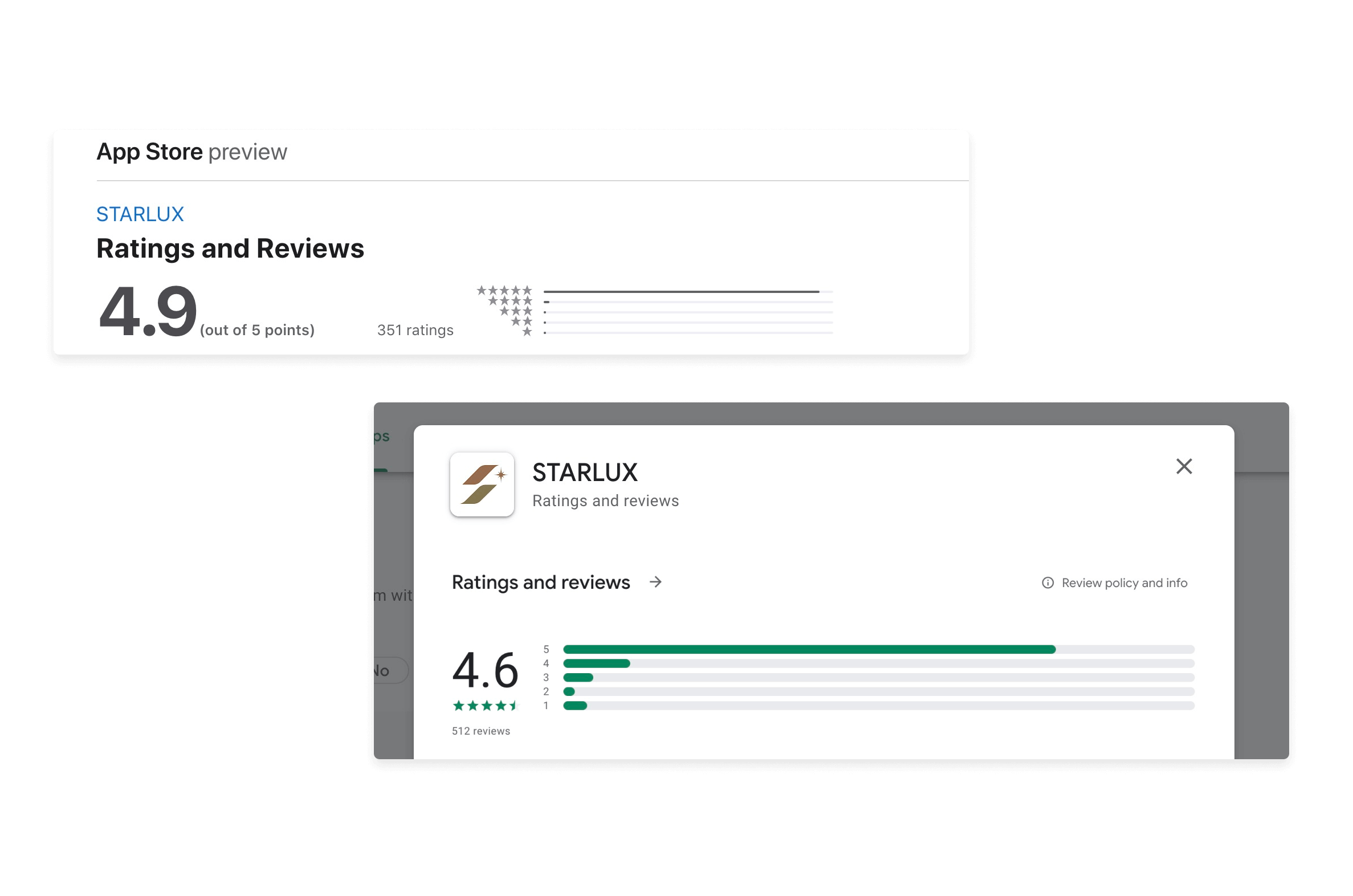
While business goals will take a while to be measurable, the new app is already getting some great responses online, especially since the project was launched during the pandemic. Customers and even the staff referred to the app as a “huge improvement” and “something that makes them even more excited to be back to the sky.” With the emphasis on passenger experience, the airline has been called The Future of Emirates in East Asia.
Next Step
Some solutions introduced as part of the program for the next stage include:
- Solo-underage and extreme minority flyers' journeys should be considered more broadly.
- Sustainably! Educate flyers on how they should book trips that reduce their CO2 emission.
- Relevant information after the flight, including ground transportation, traffic, and attractions information.
- Upgraded systems that provide high royalty members free upgrades from the airlines.
- Connecting with different airlines for transit journeys.
- Real-time luggage tracking information.
- Passports, test results, government forms, and vaccination cards should be handy.
NEXT PROJECT
2025 Eric Chen - Images and content may not be used without written permission. All rights reserved.®
