The first community bank
in Taiwan
BANKEE BANK | FINTECH PERSONAL APP
Bankee Bank
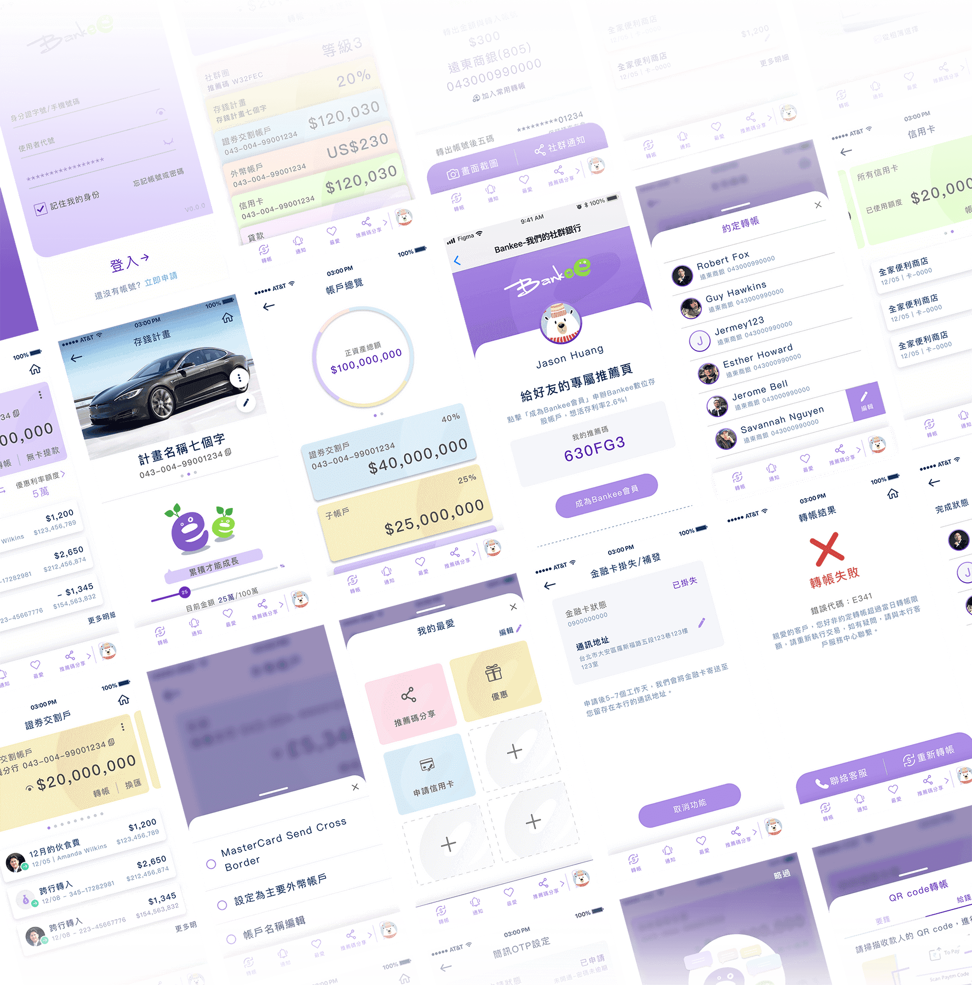
Bankee is the first fully digital bank in Taiwan under the division of one of the oldest, local banks, FarEastern International Bank. As nomadic life becomes more convenient and experiences become more prosperous by the day, most conventional banks cannot keep up with the times with their complex, cumbersome and old ways. The new app focuses on the younger generation's social and daily needs in banking.
The product received The Most Innovative Digital Bank Award by Global Economics in 2021.
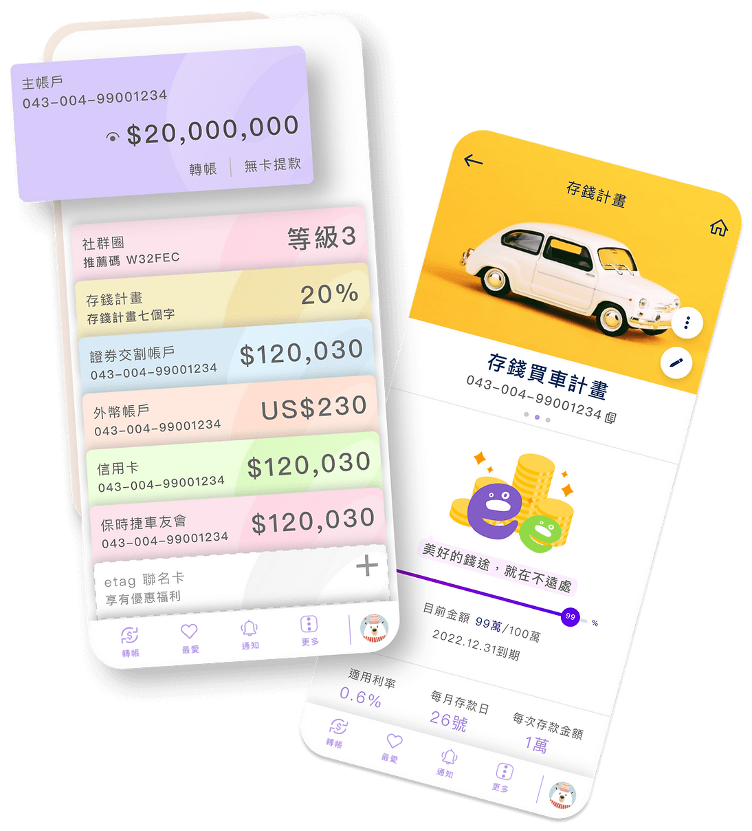
The app is updating its new feature by schedule, some of my future-facing work is under NDA, but below is a list of features that have been released to the public.
Products and Images are owned by Bankee, FarEastern Internation Bank.
MY ROLE
UX Designer
TEAM
Project Manager
Visual Designer
IT Team
Outsource Companies
CLIENT
Bankee Bank (FEIB)
PROJECT RELEASED
Q4 2020
Individual features are being released on willing basis.
All features will be fully released in the end of 2022.
MY CONTRIBUTIONS
What did I do?
Throughout this project, I did a global-wide competitive analysis to improve the existing model and conducted research studies to understand users' technology interaction habits in FinTech. All of these studies form the new social gathering features including the social circle award system, temporary joining account, automatic payment setting, and other user services.
Besides design, a lot of my time went into reorganizing the information and features of the app by collaborating with different stakeholders and departments, outsourced companies, and the government organization.
Challenge
As the first fully digital bank, the mission is to bring new ways of banking to Taiwan. With the existing loyal customers, the goal of the new division is to attract a younger generation of new clients while still improving the usability of the service to keep the existing members of the bank.
USER INTERVIEW & SURVEY STUDY
The first fully digital bank in Taiwan that seeks to revolutionize traditional banking
The future bank is not a physical place. With Bank 3.0, "bank" has become an act and service. In view of understanding the relationship between Gen Z and banking, I conducted surveys and interviewed internet banking users to understand their needs for a wide range of financial services, in the current use of existing network services.

Interestingly, 70% of the respondents said they are familiar with existing internet banking features and had not encountered many problems in operation. Upon further probing, the research shows that the users generally expect more control and functionality from some frequently used services, such as account overview, saving, fund transfer, etc. With every bank offering more or less the same Internet banking services, we started to brainstorm how might we restructure the framework based on the users' perspectives, and how to optimize each aspect to target the younger generation?
COMPETITIVE ANALYSIS & TREND RESEARCH
The Missing Pieces in Taiwanese FinTech
During our early research, I performed a detailed competitive analysis to study the habits and successes of other banks to incorporate and improve some of these findings into Bankee. The checklist is the summary of the research that I put together to compare Bankee with other financial institutions and FinTech apps across the globe.
A lot of younger banks that target gen-z have focused on social gathering and rewarding features, knowing the majority of the transaction is a relatively smaller amount.
Majority of the research studies are under NDA, Please contact me if you want to know more.
CONTEXTUAL INQUIRY
Identify the changes before innovating and reversing the situation
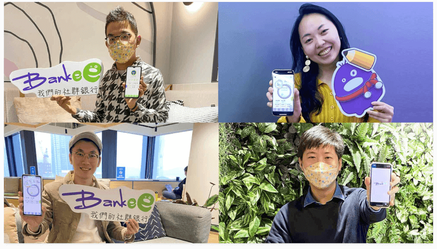
The younger generation won't walk into the bank as often, and if the operation of the mobile bank is not aligned with their daily need, they lose patience and quit immediately. In order to mitigate this social phenomenon, I conducted further contextual research to delve deep into the young age user's aspirations and financial goals.
According to our studies, it's normal for gen-z to have a common goal for friends to do things together. The longer they know each other, the more fund-related activities they do together. For example, eating together, sharing streaming service platforms, buying stuff, or even traveling.
Design Goal
The new generation is used to living with the mobile phone but is increasingly indifferent towards the traditional banks. With Bankee, I chose to emphasize the modern needs, shed the aloof image of conventional banks, revolutionize, and create a new future with digital banks and each customer's social life.
SOCIAL
Enhance the feature that needs for banking services in a social networking scenario
AUTOMATIC
Understand user's habit and daily need to provide a better automation when necessary
SECURE
Provide a safe and reliable impression for users to bank with Bankee digitally
USER JOURNEY
Gen-Z users using Social Joint Account
Based on the research completed, social needs had been mentioned a lot by Gen-Z. I brainstormed the idea of the short-term social joint account feature. As users indicated that they really did not want to think actively about their budgeting and saving in general when they are with friends, much of their experience with the app would be outside of the app itself.
This user journey map was created to show how a user would utilize this feature to successfully add to their savings toward their group trip.
Detailed information has been moditifited due to NDA
Wireframe
With the knowledge gathered from our research and the idea of the social gathering features, I started making the wireframes to demonstrate our ideas in a digital system. This was to further map out the journey of the digital banking experience while keeping in mind the key challenge we want to solve such as information organization and social gathering convenience. I also began to develop some user interface elements during this process with the UI team.
Key info has been moditified due to NDA

Community Referral Page
SOCIAL CIRCLE AWARD SYSTEM
Inviting Friends for Social Gathering
Bankee’s primary target group is the younger generation, especially Gen Z. I worked with the customer banking team to design Social Circle so that people can invite new users, add friends, and more. The more networking that happens, the more rewards they get from the bank with seasonal promotions and rebates.
SHORT-TERM JOINT ACCOUNT
Save your money with your friends together
Another feature includes short-term join accounts, which function like saving accounts with a better interest rate. The social joint account is designed so that all the members could save money together within a customizable time frame for activities such as traveling, gifting, and more. In order to lose the tension of caution of the joint account and increase the trust of the individuals. I came up with ideas to design different saving statuses so that customers can understand the situation in one sight with bankee animation.

Temporary joint account with different saving progress status
QR CODE TRANSFER
Quick Transfer Outside
Real-time peer-to-peer activity has been mentioned in my studies that people would want to navigate transactions quickly and efficiently when they are out-and-about.
For example, customers can use a QR code to transfer to their friends in quick in-moment scenarios such as in a bar.

QR Code for sending and receiving money
AUTOMATION
Bills that take care of themselves
Why should users waste their precious time regularly going to the transfer section to perform routine activities? I proposed to use automatic financial settings to prepare or pay bills conveniently.
An extreme situation for transferring is long-term repetitive transfer. If you have to transfer your streaming service fee to your freinds every month, our design for the Bankee app is to offer customers the opportunity to place regular bill payments into the activity feed, which you can set the time and amount by turning on the auto transfer. It will send push notifications so the user can pay those with a single tap.
Information Architecture & Interaction Design
Maintaining the existing organizational structure of the app was a unique and rewarding challenge of this project, from both research and design perspectives.
I talked to different departments to reorganize the features of the app and information that can be used across each sub-service. In addition, we differentiate which service emphasized financial information-based versus personal service-based. The sitemap with a task flow helps us to guide the design process. All these help the corresponding product owners inform further key decisions more effectively.

Image has been blurred out due to NDA
Thinking out of the box, how to create a more unique experience?
I worked with the IT team to imply User Generated Content framework that allows users to set their preferred features on each page of the app. For example, the user could curate their own buttons depending on their need on their favorite page such as routine withdrawal at the ATM each time.
Additionally, the app provides personalized offers that care about the users. One of the most powerful features digital banking can provide is personalized promotions. This can be ensured by using predictive analytics. It combined analysis of the user’s financial activity, social environment, and extensive data analysis on typical behavioral patterns, geolocation data, and contextual analysis. For example, location-based push notifications about the location of ATMs when users are in proximity.
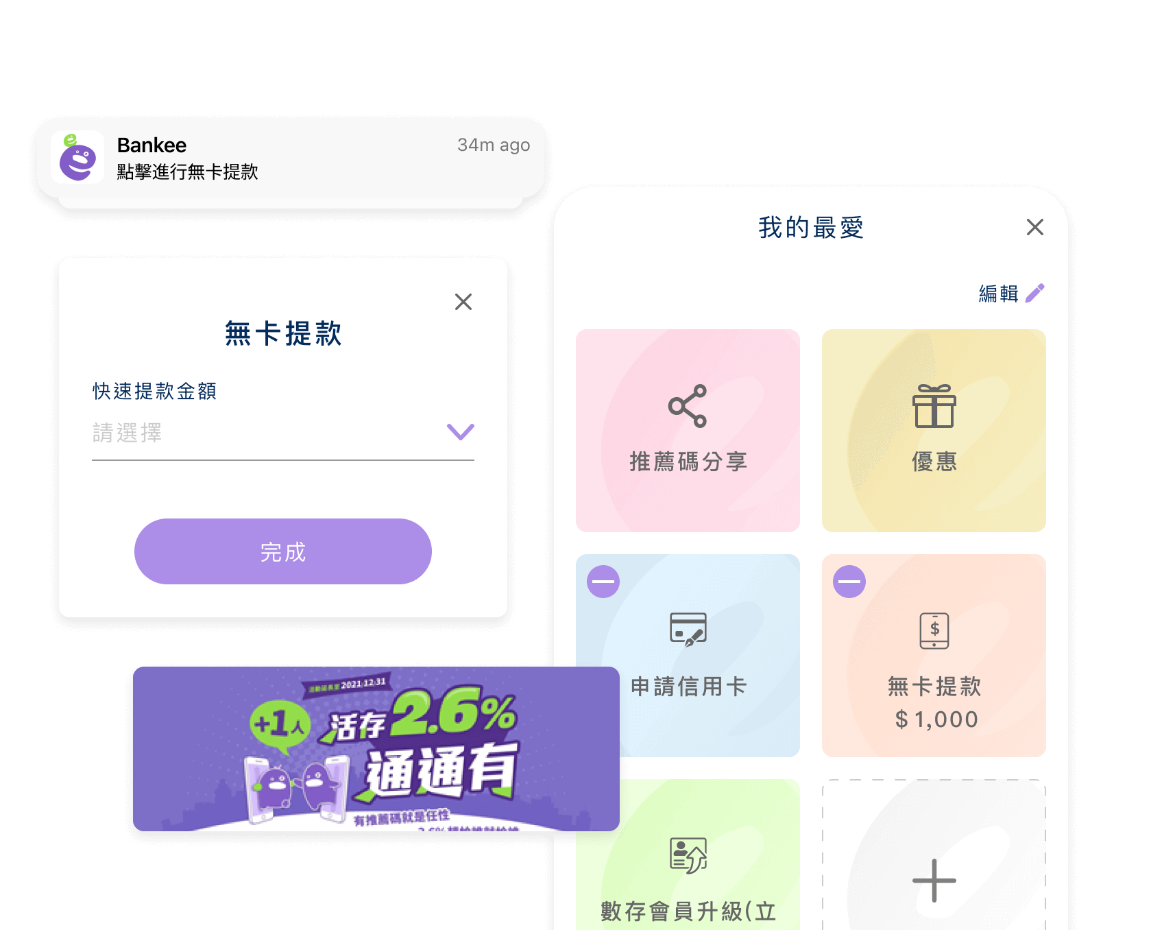
UGC content and Digital Banking elements

Password, One time Code, MOTP Device Verification
ACCOUNT SECURITY
Safe and secured from your mobile
While transferring your funds, the app needs to verify your identity to ensure who you are. I worked with Bankee and the Taiwanese Banking Association (BAROC) to discuss the balance of quick access and security route for users to enjoy a safe and convenient service.
We came up with features including MOTP device verification, which has been used 1.21 times more than one-time passwords.
IN ADDITION
Existing users: Fund Related Activity - How do we improve on these common functions?
Even though Bankee focuses on a younger user group, we still did studies on other age groups to observe their behaviors with fund saving, transfer, and exchange are the most commonly used Internet banking functions. Despite this, according to our studies, most respondents are very wary of making mistakes while performing these operations, as a slip can result in the wrong transaction value or content.
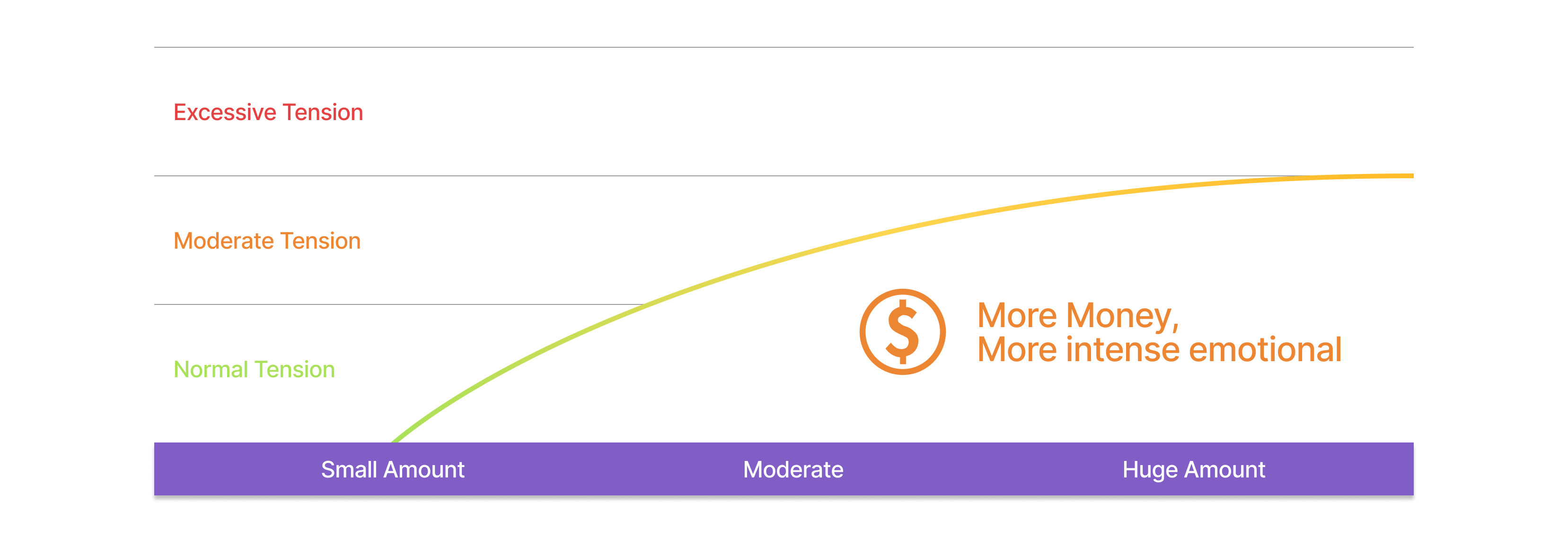
Notwithstanding this tension, how can we improve on the design?
A suitable amount of tension can make the user more focused and careful during operations.
A good design should make use of this tension to help the users focus and complete their goals more efficiently and confidently.
I proposed the design changes to the UI team for the new versions of the app.

ELEMENT 1
A more comprehensible input format
Typically, the user is required to fill in many fields on a form for funds transfer. To help the users better focus and comprehend, we rearranged the fields into three main groups with different interactions that are familiar to everyone: 1. the Source Account, 2. Target Account, and 3. Value of Transaction.

ELEMENT 2
Highlight the most important information
A lot of information is presented on the confirmation page, but the users are most concerned about the account numbers and values of transactions. We enlarged the fonts for these items and marked them with bright colors, to help the users with verification and confirmation.

ELEMENT 3
A visualized definite end point
To help ease the tension, a message emphasizing the success of the transaction will display at the end of each transaction, with clear icons and text messages.
Takeaway
As the first fully digital bank in Tawain, I observed different use cases in Taiwan to see how users respond to the concept when the service is virtual. I learned to communicate with outsourced companies and the government to arrange new features. A lot of implementation we had is still in TBD because of the banking law and technology restrictions, but it's already a big step. With the development, some of the product right now is using a web-view that was embedded in the app since it was asked to be used in crossed platforms. However, many customers enjoy the product a lot, especially the user-generated content framework that creates opportunities to make everyone’s homepage personalized and unique, as well as all the social gathering features that have been designed for daily usage.
Next Step
I would love to conduct more usability testing to see how the new feature is being used in edge cases and conduct further research on the benefit of having a spending measurement report, as to provide a broader understanding of an individual's spending habits.
NEXT PROJECT
2025 Eric Chen - Images and content may not be used without written permission. All rights reserved.®


